
You have seen the advice a hundred times: "add an image to your LinkedIn post and it will perform better." It is repeated so often that it has become background noise, the kind of tip you nod at and then ignore. But the reason it keeps getting repeated is that it is broadly true. On a feed designed to keep people scrolling, an image is one of the few reliable tools you have to make a thumb pause, and a pause is the first thing that has to happen before anyone reads your hook, clicks your link, or remembers your name.

The catch is that "add an image" is not a strategy. A blurry stock photo of a handshake will do almost nothing for you, and may even cost you reach by making your post look like an ad. This guide is about the difference between an image that works and one that just takes up space. We will cover why images lift reach and clicks on LinkedIn, which image types actually perform, the correct sizes and safe zones, the design principles behind a scroll-stopping graphic, how to make good images fast, and how to schedule them consistently so the effort compounds instead of evaporating after one good week.
Why images move the needle on LinkedIn
LinkedIn does not publish its ranking algorithm, and anyone who tells you they know the exact multiplier an image adds is guessing. What we can talk about honestly are the mechanics of the feed and the documented behaviors that images influence. When you understand those, the "why" stops being a superstition and becomes something you can design for.
The feed is a competition for attention, not a chronological list
LinkedIn shows people a ranked feed, not a raw timeline. Early signals matter a lot. In the first hour or two after you post, LinkedIn shows your content to a small slice of your network and watches what they do. If those early viewers stop, react, comment, and dwell, the post gets shown to more people. If they scroll past, distribution quietly stalls. An image is a lever on that very first decision: whether someone stops at all.
Stopping the scroll is the whole game early on
Most of the feed is text. A well-composed image breaks the visual pattern and creates a momentary stop. That stop is not a vanity metric. It is the precondition for every other action. Nobody reacts to, comments on, or clicks a post they never actually looked at. By interrupting the scroll, a strong image buys you the two or three seconds you need for your hook to do its job.
Dwell time is a signal you can influence
Platforms increasingly weigh how long people linger on a post, not just whether they tapped a button. A single photo gives the eye somewhere to rest. A carousel or document asks people to swipe through several frames, which can meaningfully extend dwell time. Longer dwell tends to correlate with wider distribution, which is part of why multi-frame formats have been punching above their weight on LinkedIn for the last couple of years.
Click-through is a separate battle
Reach and clicks are related but not the same. An image can lift reach by stopping the scroll, and it can lift click-through by making the value of clicking obvious before someone commits. A screenshot that previews what is behind a link, or a graphic that frames a clear benefit, lowers the friction of clicking. If you want the deeper mechanics of engagement specifically, our guide on how LinkedIn posts get engagement goes further on the reaction-and-comment side of the equation.
The honest summary: a good image does not guarantee reach. It improves your odds at the single most fragile moment in the funnel, the split second when someone decides whether to stop. Everything downstream depends on winning that moment first.
How much lift can you actually expect
Resist anyone selling you a precise number. The truth is that lift varies enormously by audience, format, topic, and timing. What you can reasonably expect, based on how the feed behaves and the patterns most consistent creators report, falls into ranges rather than guarantees.
- Stop rate: A strong, relevant image can noticeably increase the share of viewers who pause rather than scroll past. Think meaningful improvement, not a magic doubling.
- Reach: Because early dwell and engagement feed distribution, posts with compelling visuals often reach a wider slice of your network than plain text on the same topic. The effect is real but variable.
- Clicks: When an image previews or clarifies the payoff of clicking, click-through tends to rise versus a bare link with no visual context.
The right mindset is directional, not deterministic. Add good images consistently, measure your own results, and let your data set the expectation. Your audience is the only benchmark that matters, and we will get to measurement near the end.
Schedule your LinkedIn posts in advance
Postprism lets you plan and queue your LinkedIn image posts from one calendar so consistency stops depending on whether you remember to post. Includes a 7-day free trial.
Which image types actually perform
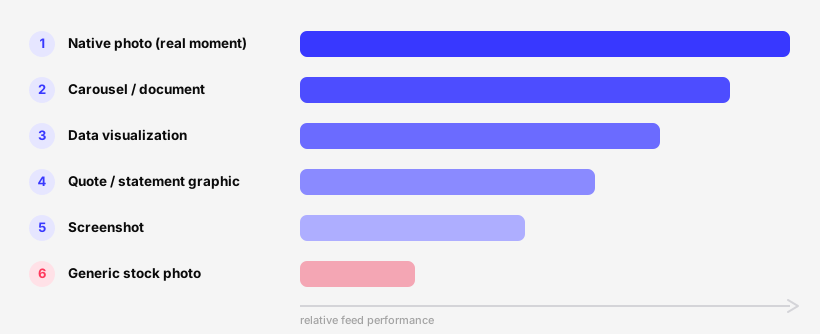
Not all images are equal. Some reliably stop the scroll and earn engagement, others quietly underperform and can even signal "promotion" to the algorithm and to readers. Here is the honest hierarchy, from most dependable to least.
Native photos that look like a real moment
Authentic, slightly imperfect photos consistently outperform polished stock. A real photo from an event, your desk, a whiteboard, a product in actual use, or a candid team shot reads as human. It signals that a person made this, not a marketing department. These do especially well when the subject is you or your work, because LinkedIn is a people-first network and faces tend to draw the eye.
Branded quote and statement graphics
A single bold statement set in clean typography on a simple background is one of the highest-leverage formats for effort spent. It pulls the core idea of your post out of the text and makes it impossible to miss while scrolling. Keep the line short, the contrast high, and the branding subtle. One memorable sentence beats a paragraph crammed into an image.
Data visualizations and simple charts
A clean chart that proves a point is persuasive in a way words rarely match. People screenshot good charts, which extends their reach beyond your original post. The key word is simple: one clear takeaway, a readable label, and no clutter. If a viewer cannot grasp the point in two seconds, the chart is too busy.
Screenshots that show, do not tell
Screenshots of a result, a message, a dashboard, a tool, or a before-and-after are credible because they are evidence. They also work hard for link posts, because they preview what is on the other side of the click and lower the friction of tapping through. Annotate them lightly with an arrow or a highlight to direct the eye.
Carousels and document posts
Multi-frame carousels (uploaded as PDF documents on LinkedIn) ask people to swipe, which drives dwell time and often outsized reach. They suit step-by-step breakdowns, frameworks, and listicles. The trade-off is effort: a good carousel takes real design time. Make the first frame a strong standalone hook, because that frame is what most people see before deciding to swipe.
The format that usually underperforms: generic stock
Generic stock photography, the handshakes, the smiling headsets, the abstract blue swooshes, tends to underperform and can actively hurt you. It reads as inauthentic, blends into every ad people have learned to ignore, and adds no information. If your only option is bland stock, you are often better served by a clean text-only post or a simple branded graphic instead.
| Image type | Typical performance | Effort to make | Best used for |
|---|---|---|---|
| Native photo | High | Low | Personal stories, events, real work moments |
| Branded quote graphic | High | Low to medium | Pulling the core idea out of the text |
| Data chart | High | Medium | Proving a point, earning screenshots |
| Screenshot | Medium to high | Low | Evidence, link previews, before-and-after |
| Carousel / document | High (for dwell and reach) | High | Frameworks, step-by-step, listicles |
| Generic stock photo | Low | Low | Honestly, almost nothing. Avoid. |
When you are unsure which format to use, default to a native photo or a single branded statement graphic. They cost the least and rarely backfire. Save carousels for ideas that genuinely need multiple frames to land.
Correct LinkedIn image sizes and safe zones
The best concept fails if the image is cropped badly or rendered fuzzy. LinkedIn displays images differently depending on placement and device, and the feed crops aggressively on mobile, where most of your audience is. Getting dimensions right is unglamorous but it is the floor your creative stands on.
Recommended dimensions by placement
Use these as practical, current targets. LinkedIn tweaks rendering over time, so treat them as strong defaults rather than permanent law, and always preview on mobile before you commit.
| Placement | Recommended size (px) | Aspect ratio | Notes |
|---|---|---|---|
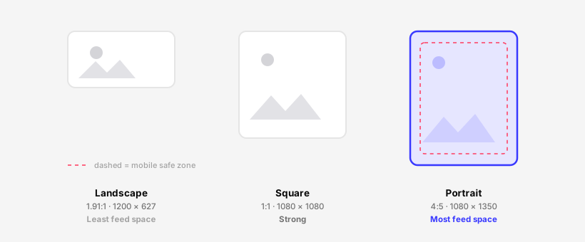
| Single feed image | 1200 x 1200 or 1200 x 1500 | 1:1 or 4:5 | Square and portrait take up more vertical space on mobile |
| Landscape feed image | 1200 x 627 | 1.91:1 | Classic wide format, smaller footprint on mobile feeds |
| Multi-image post | 1200 x 1200 each | 1:1 | LinkedIn tiles and crops these, so keep subjects centered |
| Link preview thumbnail | 1200 x 627 | 1.91:1 | Pulled from the page Open Graph image, design it deliberately |
| Document / carousel | 1080 x 1080 or 1080 x 1350 | 1:1 or 4:5 | Uploaded as PDF, portrait frames swipe well on mobile |
| Profile photo | 400 x 400 (min) | 1:1 | Displays as a circle, keep your face centered |
| Cover / banner | 1584 x 396 | 4:1 | Heavily cropped on mobile, keep key elements off the edges |
Why portrait and square usually beat landscape in the feed
On a phone, a vertical image occupies more of the screen than a wide one. More screen real estate means a longer pause and a bigger interruption to the scroll. For single images and carousels, a 4:5 portrait or 1:1 square is generally the safer choice than 1.91:1 landscape, purely because of how much vertical space it claims. Reserve landscape for link previews where the format is dictated for you.
Mind the safe zone, especially on mobile
LinkedIn crops images depending on context and device, and overlay elements like the document swipe controls can sit on top of your edges. Keep important text and faces away from the borders so nothing critical gets clipped or covered. Our LinkedIn safe zone tool shows you exactly where the crops and overlays land so you can place text where it will always be visible, and our social media image resizer gets your file to the right dimensions for each placement in seconds.
Export images at the recommended pixel dimensions rather than uploading a giant file and letting LinkedIn downscale it. You control the sharpness when you size it yourself. Aggressive platform compression of an oversized file is what makes graphics look soft.
Design principles for a scroll-stopping image
You do not need to be a designer. You need to respect a handful of principles that govern whether an image registers in the half-second a thumb spends on it. These apply whether you are shooting a photo or building a graphic.
Contrast is what stops the eye
The feed is a wash of white background and gray text. An image with strong contrast, bold colors against a clean field, light against dark, breaks that pattern and creates the stop. Muted, low-contrast images blend into the scroll and get missed. When in doubt, push the contrast.
One clear focal point
Give the eye a single place to land. One subject, one statement, one data point. Images that try to say three things say nothing, because the viewer never resolves what to look at and moves on. Decide the one thing the image must communicate and cut everything that competes with it.
Text must be legible at thumbnail size
Most people see your image small, on a phone, mid-scroll. If there is text on it, it has to be readable at that size. Use large type, short lines, and high contrast between text and background. A good test: shrink the image to the size of a postage stamp. If you cannot read the words, neither can your audience. Keep any caption text within character limits too; our character counter helps you keep the post copy tight.
Brand consistency builds recognition
Use the same two or three colors, one font, and a consistent layout across your graphics. Over time, people start recognizing your posts before they read your name. That recognition is a quiet compounding advantage. It does not require a fancy brand kit, just discipline to reuse the same simple template.
Design mobile-first, always
The large majority of LinkedIn happens on phones. Build and judge every image on a phone-sized preview. A graphic that looks balanced on a wide monitor can be cramped and unreadable on mobile. If it works on a small screen, it works everywhere.
Plan a month of LinkedIn content in one sitting
Batch your images and captions, then queue them across the calendar in Postprism so your feed stays active even on your busiest weeks. Includes a 7-day free trial.
How to make great images fast
The number one reason people stop adding images is not skill, it is time. The fix is a system that makes a solid image take minutes, not an afternoon. None of this requires a design background.
Build a small set of reusable templates
Create three or four templates you can drop content into: a quote graphic, a chart frame, a screenshot layout, and a carousel cover. Set the colors, font, and spacing once. After that, making a new image is just swapping the words or the data. Templates are the single biggest speed multiplier available to you.
Batch your image creation
Do not make images one post at a time. Sit down once a week or once a month and produce a batch. Context-switching between writing, designing, and posting is what burns your hours. When you batch, you stay in one mode and move far faster. Batching also pairs perfectly with scheduling, which we will cover next.
Use simple tools, not heavyweight software
You do not need professional design software. A browser-based design tool with templates, your phone camera for authentic photos, and a clean screenshot tool will cover the vast majority of what performs on LinkedIn. Add our image resizer to hit exact dimensions and you have a complete, low-cost kit.
Use AI as an assistant, not a crutch
AI can help you draft a graphic concept, remove a background, upscale a photo, or suggest a layout. Used well, it shaves minutes off the busywork. Used lazily, it produces the same generic AI-looking imagery everyone is learning to scroll past. Treat AI as an accelerator for ideas you already have, not a replacement for a point of view. Postprism includes optional AI assistance, but the scheduler is the core of what it does, and your images and judgment remain yours.
- Pick a template that matches your message.
- Drop in your words, photo, or data.
- Check contrast and legibility at thumbnail size.
- Resize to the right dimensions for the placement.
- Preview on mobile, then schedule it.
Pair the image with a strong hook and first comment
An image stops the scroll, but the words decide what happens next. The two have to work together. A great image attached to a weak opening line wastes the pause it just earned.
Lead with a hook that the image reinforces
Your first line is visible before anyone taps "see more." It should create curiosity, state a sharp claim, or promise a payoff, and it should align with what the image shows. If the image is a chart and the hook is a vague platitude, the two undercut each other. When they reinforce, the post feels purposeful. For a full breakdown of structure, see our perfect LinkedIn post formula.
Put links in the first comment, not the post body
LinkedIn tends to suppress reach on posts that send people off-platform, so many creators keep the outbound link out of the main post and place it in the first comment instead. Your image and hook do the work in the feed, and the link sits one tap away for people who want it. Test this with your own audience, since behavior varies, but it is a widely used pattern for a reason.
Write a caption that earns the click or the comment
Below the hook, deliver real value, then end with a clear, low-friction call to action: a question that invites comments, or a pointer to the link in the comments. Keep paragraphs short and scannable. If you want to avoid the common pitfalls that quietly tank otherwise good posts, our roundup of LinkedIn post mistakes is worth a pass.
Post the first comment with your link immediately after publishing, ideally within the first minute. That way it is in place before your early reach window opens and ready for the first wave of viewers.
Schedule LinkedIn image posts consistently
Here is the truth that no design tip can fix: one great image post does almost nothing on its own. Results come from showing up consistently, week after week, so the algorithm learns you are an active creator and your audience learns to expect you. Consistency is a scheduling problem, not a creativity problem, and it is exactly where a tool earns its keep.
Why consistency beats intensity
A post a day for a month outperforms thirty posts crammed into one frantic week and then silence. Steady cadence keeps you in the feed, compounds recognition, and gives you a real sample size to learn from. The hard part is sustaining it through busy stretches, travel, and bad days, which is precisely what scheduling solves.
How Postprism fits into the workflow
Postprism is a social media scheduler. You batch your images and captions, load them into a single content calendar, set the times, and the posts publish themselves to LinkedIn (and to eight other networks, if you want) at the moments you chose. Your creativity goes into the work once; the scheduler handles showing up. You can see how it stacks up specifically as a LinkedIn scheduler, and how the planning side works in our content calendar overview.
Build a repeatable weekly rhythm
A simple, durable cadence looks like this: batch images on one day, write captions the same session, schedule the week, then spend your live time engaging in comments rather than scrambling to create. If you are new to building a posting routine, our walkthrough on how to schedule social media posts lays out the mechanics step by step.
- Plan: Decide your themes and topics for the next two to four weeks.
- Create: Batch your images and write your captions in one focused block.
- Schedule: Queue everything in the calendar at your chosen times.
- Engage: Show up live only to reply, not to scramble for something to post.
- Review: Check what performed and feed the lessons into the next batch.
Put your LinkedIn on a schedule
Queue a steady stream of image posts in advance with Postprism and turn consistency from a willpower problem into a solved one. Start with a 7-day free trial.
Measure which images work and iterate
Every account is different. The only way to know what your audience responds to is to watch your own numbers and adjust. Treat your feed as an ongoing experiment, not a finished product.
Track the metrics that reflect the funnel
Look at impressions or reach to gauge how far a post traveled, engagement rate to see how compelling it was, and click-through where you have a link. Compare image posts against your text-only baseline so you can isolate what the image is contributing. One post tells you nothing; trends over a dozen tell you a lot.
Test one variable at a time
If you change the image type, the hook, and the posting time all at once, you will never know what moved the result. Hold things steady and vary one element: photo versus graphic, portrait versus landscape, chart versus screenshot. Over a few weeks, patterns emerge that are specific to your audience.
Turn findings into your house style
When you find an image type or format that consistently outperforms for you, make it a staple of your rotation. When something reliably underperforms, retire it. Your goal is a small, proven toolkit of formats you can produce quickly and trust. For the bigger-picture plan that all of this feeds into, see our LinkedIn content strategy for 2026.
| What you are testing | Variable to vary | What to watch |
|---|---|---|
| Does any image help? | Image post vs. text-only | Reach and engagement vs. baseline |
| Which format wins? | Photo vs. graphic vs. chart vs. carousel | Engagement rate and dwell signals |
| Best orientation | Portrait vs. square vs. landscape | Stop rate and reach on mobile |
| Click optimization | Screenshot preview vs. plain link card | Click-through rate |
| Posting time | Morning vs. midday vs. evening | Early-window engagement |
Frequently Asked Questions
Do images actually guarantee more reach on LinkedIn?
No, nothing guarantees reach. A strong, relevant image improves your odds at the most fragile moment in the funnel, the instant someone decides whether to stop scrolling. It tends to lift reach and clicks because it drives early dwell and engagement, which feed distribution, but the size of the effect varies by audience, topic, and timing. Add good images consistently and let your own data tell you the real lift.
What is the single best image type for LinkedIn?
There is no universal winner, but native photos and simple branded statement graphics give the best results for the least effort and rarely backfire. Data charts and screenshots are excellent when you have a point to prove or evidence to show. Carousels drive strong dwell and reach but cost real design time. Generic stock photography is the one type to avoid, since it reads as an ad and adds no information.
What size should my LinkedIn images be?
For single feed images, 1200 x 1200 (square) or 1200 x 1500 (portrait) work well because they claim more vertical space on mobile. Use 1200 x 627 for landscape and link previews, and 1080 x 1080 or 1080 x 1350 for document carousels. Export at the exact dimensions rather than uploading an oversized file, and run it through our image resizer to be sure.
Should I use portrait or landscape images?
For single images and carousels in the feed, portrait (4:5) or square (1:1) usually beats landscape because vertical images take up more of the phone screen, which means a longer pause and a bigger interruption to the scroll. Reserve landscape (1.91:1) for link preview thumbnails, where the format is dictated for you.
Where should I put the link, in the post or the first comment?
Many creators place the outbound link in the first comment rather than the post body, because LinkedIn tends to limit reach on posts that send people off-platform. Your image and hook do the work in the feed, and the link sits one tap away. Post that first comment within the first minute so it is ready before your early reach window opens, and test the approach against your own audience.
How do I make good images quickly without design skills?
Build three or four reusable templates (a quote graphic, a chart frame, a screenshot layout, and a carousel cover), then batch your image creation once a week or once a month instead of one post at a time. Use a simple browser-based design tool, your phone camera for authentic photos, and an image resizer for exact dimensions. AI can speed up the busywork, but use it as an accelerator, not as a source of generic, AI-looking imagery.
How often should I post images on LinkedIn?
Consistency matters more than volume. A steady cadence, for many people a few times a week up to once a day, beats a burst of posts followed by silence, because it keeps you in the feed and gives you a real sample size to learn from. The reliable way to sustain it is to batch your content and schedule it in advance with a tool like Postprism so showing up does not depend on willpower.
How do I know which images are working for my audience?
Track reach, engagement rate, and click-through where you have a link, and compare image posts against your text-only baseline. Test one variable at a time (format, orientation, posting time) so you can attribute changes accurately. Over a few weeks, patterns specific to your audience emerge. Promote the formats that consistently win into your house style and retire the ones that do not.
Turn one good week into a consistent habit
Postprism keeps your LinkedIn image posts flowing on a schedule you set once, so your best week becomes your normal week. Start your 7-day free trial today.


